

Table of Contents
- Understanding Your Foundation: Starting With a Visual Thread
- How to Mix Nursery Art Styles Without Creating Visual Chaos
- Building a Nursery Gallery Wall Ideas That Works
- How to Arrange Wall Art in a Nursery for Maximum Impact
- Choosing a Nursery Art Color Palette That Ties Everything Together
- Using Personalized Nursery Wall Art as Your Anchor Piece
- Mixing Framed Prints, Illustrations, and Wooden Signs
- Common Mistakes to Avoid When Mixing Art Styles
- Frequently Asked Questions
Last Updated: October 21, 2026
Understanding Your Foundation: Starting With a Visual Thread
When you mix nursery art styles, it doesn't have to feel chaotic.
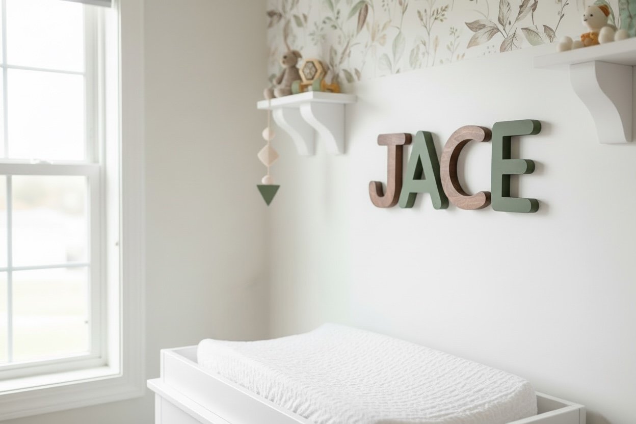
At The Fairy Paintbox, we help parents create personalized nurseries where different art styles work in harmony.
Start with one anchor piece, a personalized wooden name sign, a meaningful print, or a statement artwork that sets the tone. Every other piece should either complement it or create intentional contrast.

How to Mix Nursery Art Styles Without Creating Visual Chaos
Most nursery art advice stops at "pick a theme and stick to it," which produces rooms that look like catalog pages. Mixing styles deliberately, abstract with vintage, illustrative with photographic, gives a nursery personality a single-theme room can't match. The trick is that mixing follows a repeatable method.
Here is a step-by-step approach you can apply to any combination of styles.
Step 1: Choose Your Dominant Style (and Give It 60% of the Wall)
Your dominant style takes up the most visual space. It sets the mood and gives every other piece something to answer to.
Common dominant styles for nurseries include:
- Watercolor and pastel artwork
- Minimalist line drawings and illustrations
- Whimsical or storybook-inspired pieces
Commit to it: roughly 60% of your wall art should reflect this primary aesthetic. The dominant style gives the room direction and prevents the wall from feeling like a random collection.
Step 2: Add One Contrast Style, Not Three
The most common mixing mistake is adding too many secondary styles. Two or three total styles is the sweet spot; four or more reads as clutter, no matter how carefully each piece was chosen.
Pick one contrast style that shares at least one quality with your dominant choice, a color, a mood, or a design language:
- Watercolor pairs well with hand-lettered quotes or simple line illustrations
- Minimalist art complements nature photography or botanical prints
- Whimsical artwork works with personalized wooden letters and playful typography
If your dominant style is soft and gentle, avoid contrast styles that feel bold and jarring. The contrast should feel like a deliberate counterpoint, not a collision.
Step 3: Repeat One Element Across Every Style
This rule does the heaviest lifting. Pick one element, a color, a frame finish, a shape, or a material, and repeat it in every style.
Color is the easiest element to repeat because it's visible at a glance. Frame finish is the second easiest: matching wood tones or a consistent black frame across mixed artwork instantly creates cohesion.
Step 4: Balance Visual Weight, Not Just Size
Visual weight is how "heavy" a piece feels on the wall, not the same as physical size. A small, dark, high-contrast print can outweigh a large, pale watercolor, and a busy pattern feels heavier than empty space.
A practical rule: for every visually heavy piece (dark colors, dense pattern, bold contrast), pair it with one or two lighter pieces nearby.
Step 5: Vary Size and Shape on Purpose
Mixing sizes and shapes prevents the wall from looking flat. Pair large statement pieces with smaller prints, mix tall verticals with wider horizontals, and balance oversized wooden letters with delicate framed prints. Avoid repeating the same size or shape too many times in a row, separate three large pieces with smaller items, or add one or two differently proportioned pieces to a run of rectangular frames.
Step 6: Unify With Frames and Matting
When styles differ, framing is your quietest tool. A consistent frame finish or mat color makes mixed artwork feel curated. You don't need identical frames, matching wood tones, a shared mat width, or a single accent color is enough. Reserve the most distinctive frame for your anchor piece.
A Worked Example
Say your dominant style is soft watercolor, your contrast style is vintage botanical illustration, and your repeated element is a warm cream mat and light oak frame. Your anchor is a personalized wooden name sign in cream and sage. Hang the name sign, two watercolor animal prints, one vintage botanical print, and a small line-drawing quote, four styles, one palette, one frame family, reading as a single composition.
Building a Nursery Gallery Wall Ideas That Works
Lay your pieces on the floor before hanging anything and arrange them until the configuration feels balanced, related to each other without looking too rigid or symmetrical.
The strongest gallery walls have a clear focal point, usually a larger piece or a personalized element like a wooden name sign, with smaller pieces arranged around it.
Leave consistent spacing between pieces. Gaps don't have to be identical, but the rhythm should feel intentional: too far apart feels disconnected, too close feels cramped.
How to Arrange Wall Art in a Nursery for Maximum Impact
Placement affects how the room feels, how the pieces interact, and, in a nursery, how safe the arrangement is. Most guides stop at "hang it at eye level." Here are room-specific layouts and installation details you can actually use.
Spacing and Placement Rules
Consistent spacing creates visual harmony, a common guideline is 2-3 inches between pieces, though the right gap depends on wall size and frame depth. The center of your arrangement should sit at eye level, roughly 57-60 inches from the floor, creating a natural focal point whether you're standing or sitting. Avoid clustering all your art in one corner; on a large wall, two focal points work better than one central gallery.
Watercolor Nursery Decor Painted Wall Letters →
Room-Specific Layouts You Can Copy
Three common nursery layouts and how to handle each:
Layout 1: Single wall above the crib. This is the most common nursery wall. Treat it as a small gallery with one clear focal point, usually a personalized name sign or a large print, flanked by one or two smaller pieces. Keep the arrangement compact and centered over the crib so it reads as a single unit from the doorway.
Layout 2: Long empty wall beside the crib. A long wall benefits from a horizontal gallery, three to five pieces in a row at consistent height, with the largest piece near the center.
Layout 3: Reading nook or chair corner. Above a glider or reading chair, a small vertical stack of two or three pieces works better than a wide gallery.
Above-Crib Arrangements
The area above a crib is prime real estate but needs the most care. A personalized wooden name sign works beautifully here as the room's anchor, paired with one or two complementary pieces like a soft watercolor print or whimsical illustration.
Keep pieces securely fastened and well out of reach. Use hardware rated for each piece's weight and your wall type: wall anchors for heavy frames or wooden signs, adhesive strips for lightweight prints (checked periodically).
Nursery-Safe Installation Checklist
- Choose lightweight frames or canvas over heavy glass where possible
- Use wall anchors for anything heavier than a small print
- Keep all hanging art out of reach of the crib and changing table
- Check hardware and cords (if any) periodically as the baby grows
Testing the Layout Before You Commit
Lay your pieces on the floor in the actual footprint of your wall, then step back and look from the doorway, the angle you'll see most often. Adjust spacing and weight distribution before making a single hole. This one habit prevents most re-hanging.
Choosing a Nursery Art Color Palette That Ties Everything Together
Your color palette is the invisible thread that makes mixed art styles feel intentional, even when pieces come from different sources and aesthetics.
Choose 2-3 primary colors that appear across multiple pieces, soft pastels, warm earth tones, or cool neutrals, then add 1-2 accents.
The trick is repetition. If soft green is your primary, make sure it appears in at least 3-4 pieces across your wall for visual continuity.
Using Personalized Nursery Wall Art as Your Anchor Piece
Personalized art, especially custom wooden letters or a name sign, is the emotional anchor of your room, the piece that makes the space feel intentional and uniquely yours.
Build your palette and style around that anchor. Watercolor wooden letters in soft pastels pair naturally with complementary watercolor prints and pastel frames; bold paint-splatter letters give you more freedom to mix styles, as long as the overall feeling stays cohesive.

Mixing Framed Prints, Illustrations, and Wooden Signs
Different formats, framed prints, unframed illustrations, wooden signs, add textural variety. Framed prints feel formal and finished, working well as focal points or in polished gallery walls.
A balanced approach might look like:
- One large framed print as your focal point
- 2-3 smaller framed illustrations or prints
- A personalized wooden name sign or letter set
- One or two unframed pieces or textile art for softness
The mix of formats prevents the wall from feeling too uniform. It also allows you to play with different price points and sourcing options, you might frame a print you found at a local shop while also featuring a handcrafted wooden piece.
Common Mistakes to Avoid When Mixing Art Styles
The most common mistake is overthinking it, parents worry mixing styles will look cluttered, play it too safe, and end up with a generic wall.
Ignoring balance is another: all large pieces feel heavy, all small pieces feel scattered. Mix proportions intentionally.
Many parents also choose pieces they think they should like rather than pieces they genuinely love.
Creating a nursery that feels personal and intentional doesn't require perfection, it requires thoughtfulness.
Frequently Asked Questions
How do you make mismatched nursery wall art look cohesive?
The key is choosing a unifying element that ties everything together. This could be a consistent color palette, a shared frame style, or a dominant visual theme like nature or whimsy. Once you pick your anchor, every piece you add should either match that element or complement it. Personalized nursery wall art, like custom painted wood letters, works beautifully as a centerpiece that other prints and illustrations can orbit around. Spacing and arrangement also matter: irregular placement that feels intentional looks more cohesive than scattered pieces.
Can you mix framed prints with wooden nursery signs?
Absolutely. Mixing framed prints with wooden signs creates visual texture and depth. The key is balance: if you use wooden painted letters as a focal point, frame lighter prints around them, or vice versa. Ensure the color palettes complement each other. For example, watercolor prints pair well with hand-painted wooden letters because both have soft, artistic qualities. Make sure your arrangement has a clear hierarchy, with one element (like a personalized name sign) as the dominant anchor and supporting pieces arranged intentionally around it.
How many pieces of art should you hang in a nursery?
There's no magic number, but aim for intentionality over abundance. A small nursery works well with 3-5 pieces arranged thoughtfully; a larger wall can handle 7-10 without feeling cluttered. The goal is creating visual interest without overwhelming the space. Quality matters more than quantity. Each piece should either add color, tell part of your room's story, or serve as a personal anchor like a custom name sign. Start with your anchor piece and add supporting art until the wall feels balanced and purposeful, not empty or crowded.
How do you choose colors for nursery wall art?
Start by identifying 2-3 colors you want to anchor your nursery. These become your base palette. Then choose art that either matches these colors directly or complements them. Soft greens, warm earth tones, and pastels work well for creating a cozy atmosphere. If you want a pop of color, let one piece (like vibrant painted wood letters) provide that accent, and keep surrounding prints softer. Avoid mixing too many unrelated colors, which creates visual chaos. Your personalized art is a great place to introduce multiple colors because it's intentional and focal.